You have less time than a single blink.
In roughly 50 milliseconds, about one-twentieth of a second, a shopper decides whether your online store looks trustworthy or forgettable. They haven’t read your headline. They haven’t checked your price. They haven’t scrolled to your reviews. Yet the verdict is already in.
This isn’t marketing folklore. Back in 2006, researcher Gitte Lindgaard and her team at Carleton University flashed web pages in front of participants for just 50 milliseconds and asked them to rate the visual appeal. Astonishingly, those snap judgments matched the ratings people gave after far longer viewing. Years later, Google researchers pushed the finding further and showed that users form aesthetic impressions in as little as 17 to 50 milliseconds, and that they strongly prefer designs that feel both simple and familiar.
So before a customer processes a single word, your product page has already spoken. And on most WooCommerce stores, the loudest element on that page is your WooCommerce product gallery.
A Tale of Two Stores
Picture two online shops. Call them Northbound and Rangewell.
They sell the exact same product: a matte-black leather backpack, same supplier, same $189 price, same free shipping. They run the same ads, attract the same visitors, and write nearly identical descriptions. On paper, they should convert at the same rate.
They don’t. Northbound quietly outsells Rangewell three to one. The difference isn’t the product. It’s the first 50 milliseconds.
When a shopper lands on Rangewell’s product page, they meet the default WooCommerce gallery: a single flat image with a row of plain thumbnails stacked beneath it. Nothing is broken. But nothing feels considered, either. The layout looks like every abandoned store the visitor has already bounced from. Within that first flash, the brain files it under “generic” — and skepticism sets in before the price even registers.
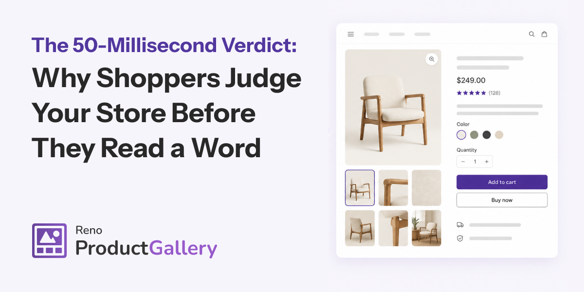
Now visit Northbound. The same backpack appears inside a clean, layered gallery. A crisp main image sits beside neatly aligned thumbnails. The active thumbnail wears a subtle outer-line highlight, so the eye always knows where it is. Every image looks razor-sharp, even on a high-resolution laptop screen. In 50 milliseconds, the visitor’s brain files this one under “premium” — and suddenly the $189 feels not just fair, but expected.
Same bag. Same price. Two completely different verdicts. And the customer never consciously noticed why.
What the Eye Actually Judges in a Flash
Here’s the uncomfortable truth: in that opening moment, shoppers don’t evaluate your product. They evaluate your competence.
The brain can’t assess leather quality or stitching in 50 milliseconds. So it reaches for a shortcut instead. It reads polish, structure, and familiarity, then borrows those signals to judge everything else — including how much it trusts you with a credit card. Designers call this the aesthetic-usability effect: people perceive attractive interfaces as more usable and more credible, even when the underlying function is identical. The Nielsen Norman Group has documented this pattern for years.
The Stanford Web Credibility Project found the same thing from a different angle. When researchers asked people why they trusted or distrusted a website, nearly half — about 46% — pointed first to visual design rather than to the actual content. In other words, your product page design is your credibility, whether you intend it to be or not.
What Makes a Product Page Look Trustworthy?
A product page looks trustworthy when its visuals load fast, look sharp, and follow a familiar, well-structured layout that lets shoppers explore the product instantly. Three ingredients do most of the work:
- A clear gallery layout that organizes images the way shoppers already expect, so nothing feels confusing in that first glance.
- Crisp, high-resolution imagery that stays sharp on modern retina screens, which signals that the brand genuinely cares about quality.
- Obvious visual cues — like a highlighted active thumbnail — that show shoppers exactly where they are and what to explore next.
Get those three right, and trust arrives before your copy ever has to argue for it.
The Anatomy of a First-Impression Gallery
So what separated Northbound from Rangewell? Not budget. Not better photography. Simply a WooCommerce product gallery built for that 50-millisecond window.
Consider the gallery layout first. WooCommerce ships with one default arrangement, and shoppers have quietly learned to associate it with lower-effort stores. A purposeful layout — thumbnails on the left like a boutique, or neatly beneath the main image like a marketplace — instantly reads as intentional. Familiar structure lowers the visitor’s cognitive load, and Google’s research shows that familiarity is exactly what the brain rewards in those opening milliseconds.
Then there’s the active thumbnail style. On Rangewell, every thumbnail looks the same, so shoppers lose track of which image they’re viewing. On Northbound, a clean outer-line highlight frames the active thumbnail — the same subtle cue you’ll notice on Apple’s own product pages. That single detail turns a static grid into a guided experience, and guidance always feels like professionalism.
Finally, retina-ready images carry the whole impression home. A backpack shot that looks crisp on an old monitor can turn soft and pixelated on a modern high-density display — and a blurry hero image screams “amateur” faster than any typo ever could. Serving 2x-resolution images keeps every stitch sharp on the screens most shoppers actually use, and sharpness reads instantly as quality.
Notice that none of these choices touch the product itself. Yet together they completely rewrite the verdict.
Want your store to win that first glance? Reno Product Gallery gives you that first-impression layout in minutes — polished gallery layouts, Apple-style active thumbnails, and retina-sharp images, all built for WooCommerce.
Why a Strong First Impression Compounds
A powerful opening glance doesn’t just feel nice — it pays off all the way down the funnel.
First, it lifts conversions. Salsify’s 2025 Consumer Research Report found that 77% of shoppers consider high-quality images and videos important to their buying decisions. So when your gallery delivers on that expectation immediately, more visitors stay long enough to reach the “Add to Cart” button.
Second, it protects you after the sale. Returns remain one of e-commerce’s most expensive problems, and the National Retail Federation reported that returns reached roughly 16.9% of U.S. retail sales in 2024. A large share of those returns trace back to a single sentence shoppers repeat constantly: “It didn’t look like this online.” Because a well-built gallery shows the product clearly — from every angle and in full detail — it closes that gap and sends fewer parcels back to your warehouse.
Third, it builds brand memory. Since first impressions form fast and then stick, a polished product gallery doesn’t merely win one sale. It shapes how a shopper remembers your store the next time they see your name.
Back to Northbound
Months later, Northbound and Rangewell still sell the identical backpack at the identical price. But Northbound’s visitors linger, zoom, swipe through the gallery, and buy. Rangewell’s visitors glance, hesitate, and drift away — never quite sure why.
That’s the quiet power of the 50-millisecond verdict. Your shoppers will never tell you they left because your gallery looked ordinary. Instead, they’ll simply leave. And the stores that respect those first 50 milliseconds will keep winning the customers everyone else loses in the very same instant.
Your product deserves a better first impression. So give it one.
Ready to win the first glance? Build a product gallery that earns instant trust with Reno Product Gallery.
Frequently Asked Questions
How fast do shoppers judge a product page?
Research from Carleton University shows people form a visual opinion of a web page in about 50 milliseconds. Google’s follow-up research narrowed that window to as little as 17–50 milliseconds — faster than a single blink.
What makes a product page look trustworthy?
Fast-loading, high-resolution images arranged in a clear, familiar gallery layout with obvious navigation cues. Shoppers read visual polish as credibility before they read any text on the page.
Does the default WooCommerce gallery hurt conversions?
It rarely breaks anything, yet its generic look can read as low-effort in that first glance. A purpose-built WooCommerce product gallery with intentional layouts, highlighted thumbnails, and retina images signals quality instantly.
Why do product images matter more than descriptions?
Because the brain processes images far faster than text. Shoppers form their first impression from visuals alone, then use that impression to judge everything else on the page — including your price and your trustworthiness.
Originally published at https://renoproductgallery.com/blog/ on July 28, 2026.